
Kawaii & Coquette · iPhone & iPad
A satin bow
on the play button.
Coquette is cream, satin and pearls. Kawaii is candy and sticker hearts. Either one repaints the whole player, not one accent colour.
Free to use. Pro is one payment — forever.
- Coquettecream, satin, pearls
- Kawaiicandy, stickers, round
- Offlinenothing to download
Cute is a material, not a hue
Any app can tint a button rose. What decides whether a music player reads as soft is the stuff underneath — the edge, the stroke weight, the typeface, and whether anything is stuck to the frame.
Two looks go at it from opposite directions, and they are not two shades of one idea.
Coquette — cream, satin, pearls
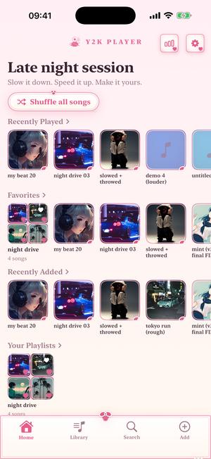
The ground runs blush #FFEFF5 at the top into an ivory #FFF9F0 at the bottom, with cards sitting on it at an almost-white #FFFDFB. Two accents do the rest: a rose #E85D8A and a warm champagne gold #D4AF7A, which are also the two ends of the waveform gradient under your artwork.
The furniture is where the theme lives. Every panel carries a rose line with a second, fainter line stitched a few points inside it — a double hem. A satin bow rides the crown of the card: two white-edged loops, a knot, two ribbon tails, all drawn as shapes rather than pasted in as a picture. A short string of pearls sits at the foot. The lettering is a serif, because ribbon-and-pearl is an editorial voice rather than a bubbly one.
Kawaii — candy, stickers, pillows
Pink #FFE9F4 falling into peach #FFF6EB, white cards, and an accent pair of hot pink #FF7EB6 against lilac #B79CF5. Panels are pillowy, outlined in a heavier pink stroke, with die-cut sticker hearts riding the frame itself — white-edged, tilted a few degrees, stuck onto the border rather than dropped into the middle of a card.
Controls here are near-circles rather than pills, the type is rounded, and the theme carries a four-colour ramp the visualizer blends across — strawberry #FF9EC9, peach #FFD3A9, mint #AEE8CD, baby blue #AECBFF. The candy shelf.
Where the bow actually lands
Decoration that only shows up on a settings screen is a swatch. These land on the controls you touch while a song is playing.
On Coquette the knob on the tempo slider is a pearl — an off-white sphere with a rose rim, riding the track. The play button is a pearl disc with a rose glyph struck on it and a bow perched on top. Library rows sit on cream, and the row that is playing blushes. Album art keeps its square, because a sleeve you cannot recognise is not decoration: the cover gets a ribbon hem instead, rose outside with a pearl-white line just within it, and the theme's charm moves to the bottom-right corner — a heart at thumbnail size, a bow once there is room for one to read as a bow.
On Kawaii that same slider knob is a sticker heart. Buttons become squishy near-circles with a candy outline, the pill behind the player controls goes plain white with a pink hairline, and the playing row blushes a shade warmer.
Making the player pink
Five taps, and none of them are setup.
- Get your songs inImport audio files, or share them into Y2K Player from wherever they already sit on the phone. The app plays files you own — there is no catalogue to browse and no account to make before anything works.
- Open the look pickerIt sits near the top of Settings, and the same sheet opens from the home and player screens. Each entry is the real app rendered small rather than a colour chip, so the bow you are looking at is the bow you are about to get.
- Tap Coquette or KawaiiThe change lands everywhere at once — cards, sliders, playhead, rows, tab bar and typeface — with no restart and nothing to fetch. Setup offers the same grid on its second page, so you can try one on before you have imported a single track.
- Point the visualizer at itOpen a song, tap the visualizer button and pick Charm, Papillon or Mochi. Leave the colour mode on Match theme and the scene puts on your theme’s own palette instead of its own.
- Change the tile on your home screenAlternate app icons live further down in Settings. Coquette and Bloom are the two that finish this look; swapping one takes effect on the home screen straight away.
Coquette, and where people go from it
The same app, captured the same way, wearing four looks.
Coquette 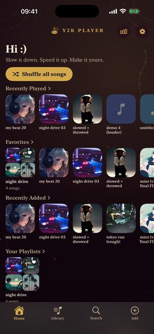
Rosarium 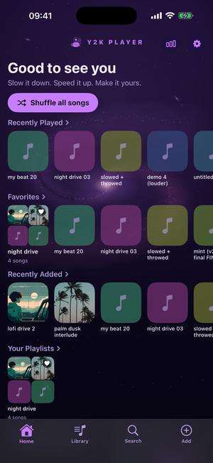
Galaxy 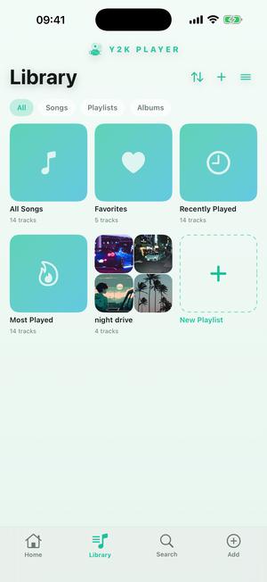
Mint
Rosarium is the answer to “cute, but goth” — a rose garden after dark, with gold filigree breathing in the corners where the interface never sits. Galaxy keeps the softness and loses the pink. Mint is one of the free looks, for soft without any of it.
If the pastels are what you came for, the shelf carries on past those: Cotton Candy runs pink into pale blue on white, Blush is the quietest of them at dusty rose over a warm neutral, Bubblegum is for wanting cute without a bright screen at midnight, and Petal and Orchid put pink and lilac behind glass.
The part that moves
A visualizer runs behind the player and full screen, drawn live from the song. Some were built for exactly this corner of the catalogue.
Charm is glass hearts drifting in rose light, with a shimmer running through them on every kick. Papillon is a glass butterfly in a violet void: the wings fold with real depth on the beat grid, a kick rings a shockwave outward, and sparkle falls from the wingtips. Mochi is a glowing kitten that dances — ears wiggling on the low end, whiskers catching the highs. Lotus is a glass flower with light rippling through its petals, and Dew is glossy bubbles bouncing upward on the beat.
Colour is a separate switch from the scene. Left on Match theme, whichever scene you pick wears the palette of the look you are in, so Coquette's rose or Kawaii's candy ramp carries straight into it. Set it to Classic and each scene keeps the colours it was drawn in — worth doing once, because Charm's own rose is not the same rose.
Soft, and still readable at arm’s length
The usual failure of a pastel interface is pale grey text on a pale pink card: lovely in a screenshot, unusable on a bus. Every palette in this app is measured against a 4.5:1 contrast floor for body text, taken at the worst ground the colour can actually land on. That is why Coquette's lettering is a deep plum-brown #3A2430 rather than a tasteful grey, and Kawaii's is a dark mulberry #46283A.
The decoration is held to the same rule from the other direction. Bows, pearls and sticker hearts are drawn onto the frame after the card is clipped, so they ride the border and never cross a song title, and none of them can take a tap meant for a control.
The look reaches the home screen too: there is an alternate app icon called Coquette, another called Bloom which is a flower in rose, and the tile the app arrives wearing is a pink ribbon on a black plate. Nothing outside Y2K Player is touched.
Underneath the ribbon it is a speed and pitch player
The look is why people arrive. What keeps the app installed is what it does to a song. The tempo slider covers 0.5× to 1.5×, and the steppers either side of it reach down to 0.25× and up to 2×. Pitch moves twelve semitones in each direction. The two are linked by default, so pitch follows speed the way a record does when you slow the platter; unlink them and the key holds while the length changes.
Presets set both at once if you would rather not fiddle: Slowed + Reverb drops to 0.85× and opens a wide room around it, Dreamy sits at 0.88×, Nightcore runs 1.35×, and Chopped screws down to 0.72× and trips over the beat every couple of bars.
All of it happens to audio files that are already yours, imported or shared in from wherever they live on the device. Nothing is pulled out of a streaming service and nothing leaves the phone.
Before you install anything
- Coquette and Kawaii are Pro looks. Tapping either during setup, or from the picker later, opens a 72-hour window — and the app says so as the window opens, not once it has run out.
- Free to use. Pro is one payment — forever.
- Nothing downloads. Looks ship inside the app, so switching one works in airplane mode.
- Every look is original work. Built in the spirit of an aesthetic, never copied from anybody's product.
- A look is never a gate. Nothing the player can do depends on which one you are wearing.
Questions about the soft looks
What people ask before they let an app anywhere near their music.
Is there a coquette theme?
Yes, and it is called Coquette. Cream cards on a blush-into-ivory ground, every panel drawn with a rose line and a fainter line stitched just inside it, a satin bow on the crown of the card, pearls at the foot, and serif lettering throughout. It is one of the Pro looks.
Is there a kawaii theme?
Yes. White pillow cards on pink-into-peach, a heavier pink outline, die-cut sticker hearts riding the frame, near-circular buttons and rounded type. Its accents run hot pink into lilac, and its visualizer ramp is strawberry, peach, mint and baby blue.
What is the difference between them?
Material and voice. Coquette is quiet and slightly grown-up — rose against a champagne gold, serif type, nothing saturated. Kawaii is loud in a soft way — hot pink against lilac, everything round, everything squishy. The corner radius, the stroke weight and the typeface all move when you switch, so they do not read as two shades of one screen.
Do the bows and hearts get in the way?
No. They are drawn onto the panel’s frame after the card is clipped, so they ride the border rather than sitting over a song title, and none of them can take a tap meant for a control. Album art also keeps its square: a cover gets a ribbon hem and a small charm in the corner, never a crop.
Is pale pink readable, though?
That is the failure mode these were built against. Every palette in the app is measured to a 4.5:1 contrast floor for body text, at the worst ground the colour can land on — which is why Coquette’s lettering is a deep plum-brown and Kawaii’s is a dark mulberry rather than a tasteful grey.
Can I try them before paying?
Yes. Tapping either one opens a 72-hour window, and the app tells you the window has started as it starts rather than after it ends. The same window covers a Pro visualizer, so you can try a look and a scene together.
Are there other pink or pastel themes?
Cotton Candy is pink into pale blue on white, Blush is dusty rose over a warm neutral, Lavender Bloom is white and violet, and Petal and Orchid put pink and lilac behind glass. Bubblegum is the dark one, hot pink and violet over near-black plum. Rosarium goes the other way entirely: plum, antique gold and parchment, with gold filigree in the corners.
Is there a cute visualizer to go with it?
Charm is glass hearts drifting in rose light. Papillon is a glass butterfly whose wings flap on the beat grid. Mochi is a glowing kitten that dances to the low end. Lotus is a glass flower and Dew is glossy bubbles. Leave the colour mode on Match theme and any of them takes your theme’s palette.
Can I make the app icon pink as well?
Yes. There is an alternate icon called Coquette and another called Bloom, a flower in rose, and the icon the app ships with is a pink ribbon on a black plate. Changing it affects the tile on your home screen and nothing else.
Do the themes need a connection?
No. They are built into the app rather than downloaded, so switching one works with the phone in airplane mode and there is no wait between choosing and seeing.
Does the look change what the player can do?
Not at all. Tempo runs from 0.25× to 2× and pitch moves twelve semitones either way whichever theme you are wearing. A look is a look.
Does it work with songs from a streaming service?
No. Y2K Player works on audio files you already own — imported or shared into the app from wherever they live on the device. Protected streaming copies cannot be read by any app.
Put a bow on it.
Free to use. Pro is one payment — forever.
Free to download and keep. Pro is a one-time purchase — buy it once and it never renews.