
Themes · iPhone & iPad
Pick an era.
The whole app changes.
Not an accent colour. The library, the player, the sliders, the playheads and the tab bar all move together.
A set of themes is free. There is a three-day window to try the others.
- Every eraY2K, Aero, vapor, kawaii, arcade
- Every screennot just the player
- Instantno restart, no download
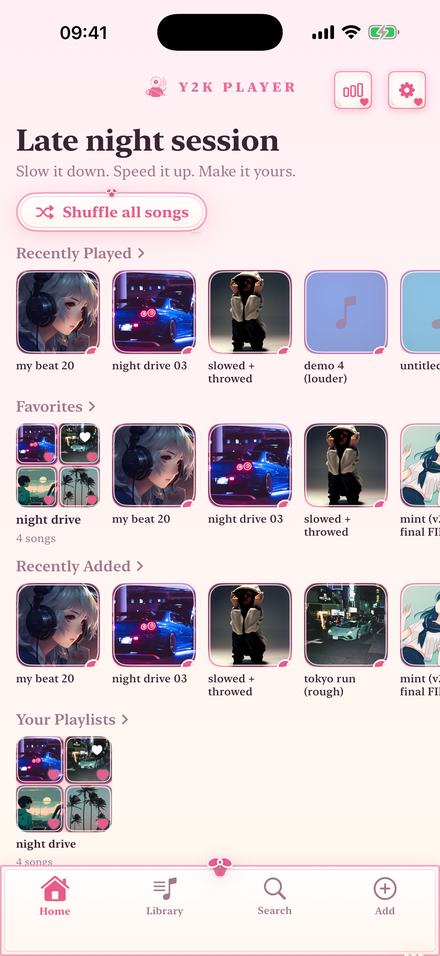
A theme here is the whole app, not a tint
Most apps that offer themes offer a highlight colour and a dark mode. This one repaints every surface: the ground, the glass over it, the seams between panels, the corner radius, the sliders, the playhead, the tab bar and the type.
That is the difference worth understanding before you look at the pictures below. Two themes can share a hue and still feel nothing alike, because one has 30-pixel corners and wet glass and the other has hard edges and monospaced type. Frutiger Aero and Y2K chrome are both blue. They are not the same app.
It also means the change is not skin deep in the boring sense: switch to Halftone and the cards stop being glass and start being paper; switch to Arcade and the controls stop being rounded at all. The player does not merely change colour, it changes material.
Frutiger Aero
The look of everything between roughly 2004 and 2012: wet glass, aqua and green, bubbles, a lot of light and gloss on every edge. Breeze is the flagship of that family here — glossy aqua-and-green glass with rounded pills — and Aqua, Fathom and Meadow sit around it at different depths of water. If the phrase means anything to you at all, start with Breeze.
Y2K chrome
The earlier end: brushed steel, silver-blue, hard specular highlights and a slightly industrial confidence. Stargaze is the calm version — navy with a starfield — and Chrome, Platinum and Dial-Up take it further toward the metal.
Vaporwave
Purple dusk, magenta grid floors, hot pink on everything that can be pressed. Vaporwave is the one named after it; Galaxy, Neon and After Hours are its neighbours if you want the palette without the grid.
Kawaii and soft
The light end of the catalogue, which mostly does not exist in music players at all. Coquette is cream and blush with ribbon-soft edges; Kawaii, Bubblegum, Petal and Cotton Candy go progressively sweeter. These are also the themes that make the strongest case for the feature, because a player that looks like this is not otherwise available.
Changing the look
One tap, and nothing has to restart.
- Open the theme pickerIt is in Settings, at the top. Every theme is listed as a live preview of the actual app rather than a colour chip, so you are choosing a screen you have already seen.
- Tap oneThe change happens immediately and covers everything at once — the library, the player, the waveform, the sliders, the tab bar. No restart and nothing to download.
- Try the ones you have not boughtAnything in the Pro set opens a three-day window the first time you use it, and the app says so at the moment it starts rather than after it runs out.
- Let the visualizer follow, or notMatch theme in the visualizer picker recolours the scene to the theme you just chose. Switch it off if you would rather each scene kept its own palette.
- Leave itThe theme is remembered, and it rides your own iCloud so a new phone opens in the look you were already using.
Some of the looks
These are the same app, photographed the same way, wearing different themes. There are many more inside.
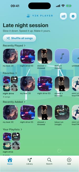
Breeze 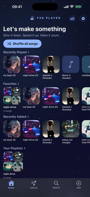
Stargaze 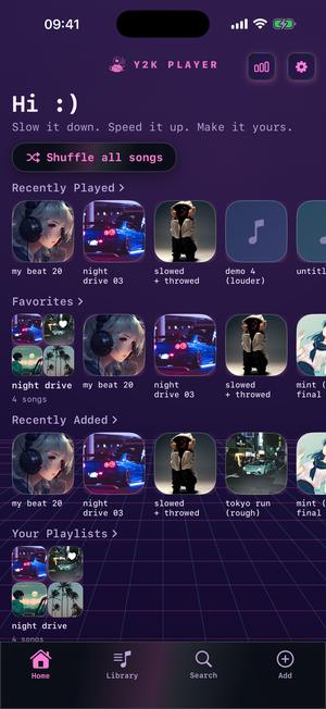
Vaporwave 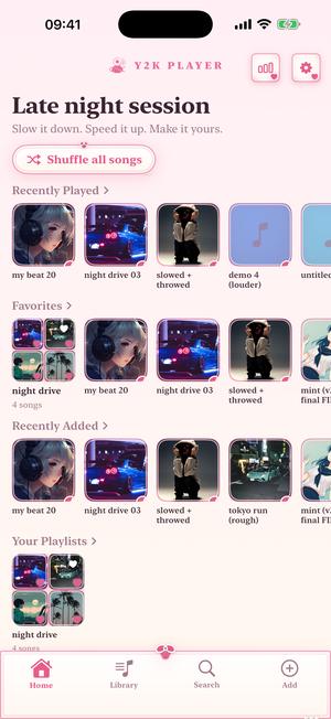
Coquette 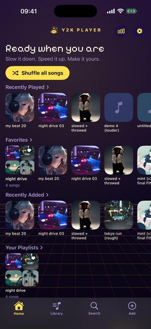
Arcade 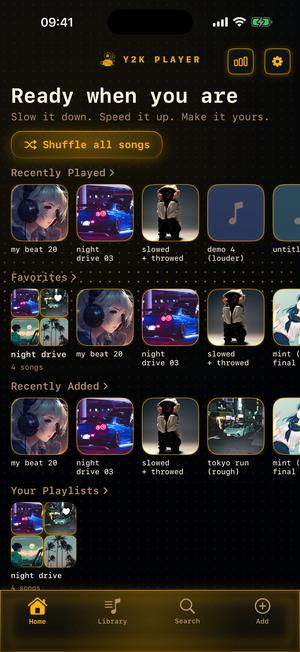
Diode 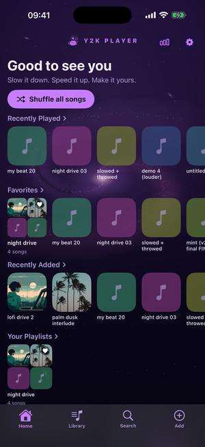
Galaxy 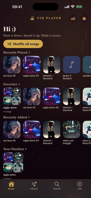
Rosarium 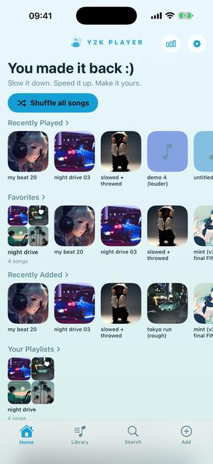
Aqua 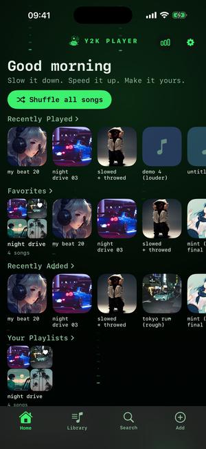
Cipher 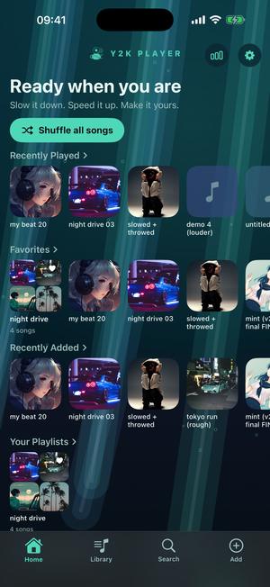
Fathom 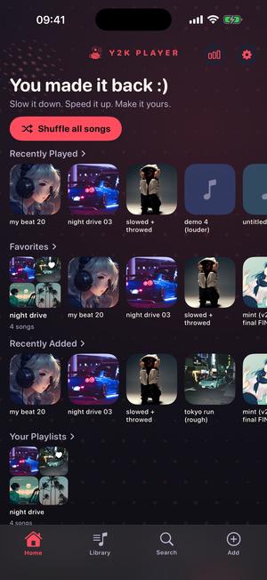
Halftone 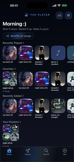
Wave 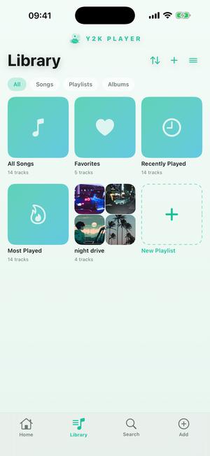
Mint
How far a theme actually reaches
The picture above is the home screen. Here is the same theme two screens deeper, which is where most themed apps stop and this one does not.
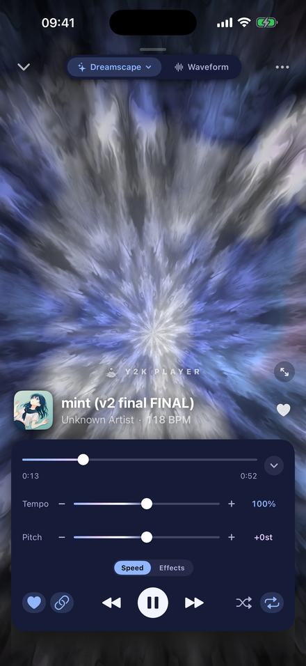
The player, wearing the same theme
The tempo and pitch sliders, their fill, their knobs and their readouts are all part of the theme. So is the playhead, the artwork frame, the button row and the sheet that slides up over it.
This is the screen you actually spend time on, which is why it is the one worth judging a theme by. A theme that only paints the home screen is a wallpaper.
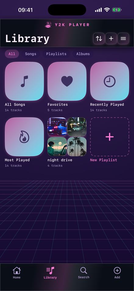
The library too, down to the shelves
Shelves, rows, section headers, the search field and the tab bar along the bottom all carry the theme. Nothing on the way to a song is left in a default grey.
Whether you notice this consciously is beside the point — you notice an app that is themed in two places out of six, and what you notice is that it feels unfinished.
You see the theme before you choose it
The picker does not show swatches. Every entry is a live miniature of the real app in that theme, drawn with the same code that draws the app, so what you tap is what you get. That matters more than it sounds: a name and a colour dot tell you nothing about whether a theme has hard edges or soft ones, glass or paper, and those are the parts you live with.
Anything in the Pro set opens a three-day window the first time you use it. The app says so when the window starts rather than when it ends, which is the only version of that mechanic that is not a trap. The window covers themes and visualizers; the effect rack is Pro from the start and is not in it.
The icon on your home screen changes too
There is a small family of alternate app icons, and a few of them are free. It is a detail, but it is the detail that decides whether the app looks like it belongs on your home screen next to everything else you picked.
What a theme does not do is change your wallpaper, your other apps or anything outside Y2K Player. The scope is the app.
Before you install anything
- A set of themes is free — one dark, one light — and they never expire. The rest are part of Pro, with a three-day window to try them.
- The effect rack is not in that window. Reverb, EQ and the rest are Pro from the start. Tempo and pitch are free on every track.
- Pro is one payment. It opens every theme, including the ones added later, and it does not renew.
- A theme is a look, not a feature gate. Nothing the player can do depends on which theme you are wearing.
- Themes are original work. They are built in the spirit of an era — they are not copies of anybody’s product, and no company’s marks appear in them.
Questions about the themes
What people ask before they trust an app with their library.
How many themes are there?
Over fifty, and the number has only ever gone up. New ones arrive with updates and Pro includes them without a second payment.
Does a theme change the whole app or just one screen?
The whole app. The library, the player, the waveform screen, the sliders, the playhead, the sheets and the tab bar all change together, and the corner radius and the material change with them — not only the colours.
Are any themes free?
Yes, and permanently: one dark and one light, either of which is a complete look rather than a stripped-down preview. The rest are part of Pro.
Can I try a Pro theme before buying?
Yes. Using one opens a three-day window, and the app tells you at the moment it starts rather than after it ends. The window covers themes and visualizers. The effect rack is not in it.
Is there a Frutiger Aero theme?
Several. Breeze is the flagship — wet aqua-and-green glass with rounded pills — with Aqua, Fathom and Meadow around it. They are original designs in the spirit of that era rather than recreations of any particular product.
Is there a vaporwave theme?
Yes, plus its neighbours: Galaxy, Neon and After Hours if you want the palette without the grid floor.
Do themes need a connection?
No. They ship inside the app, so switching one works in airplane mode and there is nothing to download when you pick one.
Does the visualizer follow the theme?
If you want it to. Match theme in the visualizer picker recolours the scene to whatever theme the app is wearing; switch it off and each scene keeps its own palette.
Can I change the app icon as well?
Yes, from a small family of alternates, and a few of those are free.
Will my theme follow me to a new phone?
Yes. The theme you chose rides your own iCloud, so a new device opens in the look you were already using. Your audio files do not sync — those live on each device.
Do I keep the themes I bought if I stop paying?
There is nothing to stop paying. Pro is a one-time purchase, so it does not renew and nothing switches off later.
Can I make my own theme?
Not today. The catalogue is hand-built, which is why the themes reach every screen instead of tinting one.
Where to go next
- VisualizersThe moving half of the look, drawn live off the track.Open →
- ProOne payment, the whole catalogue, and what else is in it.Open →
- Slowed + reverbThe sound most people are wearing a theme for.Open →
- Works offlineWhy none of this needs an account or a connection.Open →
- Frutiger Aero Themes for an iPhone MusicFrutiger Aero · iPhone & iPadOpen →
- Cute Music Player for iPhoneKawaii & Coquette · iPhone & iPadOpen →
Wear the one you would have picked in 2005.
The player is free and so are two of the looks. Nothing needs an account, and nothing here expires.
Free to download and keep. Pro is a one-time purchase — buy it once and it never renews.