
Frutiger Aero · iPhone & iPad
Wet glass, green grass,
and a music player.
The mid-2000s look rebuilt as a family of themes: frosted panels, a sky-into-grass gradient, and a horizon that keeps drifting past behind your library.
Free to use. Pro is one payment — forever.
- Wet glasspanels, tiles, the play button
- A moving skydrawn on device, 12 fps
- Offlineno account, nothing fetched
The aesthetic, in three ingredients
Frutiger Aero is the name people gave, years later, to the way screens looked from the middle of the 2000s into the early 2010s. It got its name late because nobody needed one at the time.
Glass. Panels you can partly see through, lit hard along the top edge, finished with a thin white rim and a soft coloured glow underneath. Not transparency for its own sake: transparency that behaves like a material, with thickness and a shine.
Nature. Sky, grass, water, bubbles — ordinary furniture, not an occasional flourish. The horizon was the wallpaper, and the wallpaper was rather the point.
Light. Everything is wet. Every edge catches a highlight, nothing is matte, and the surface behaves as though the sun is just above the status bar.
What made it a mood rather than a style was the assumption underneath: that the machine was going to be pleasant. Every theme named here was built for this app. The era is the reference. Nobody’s product is.
Breeze takes it literally
Most themes are a palette. This one is a place.
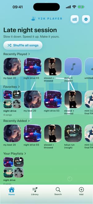
The ground runs sky-blue at the status bar down into sunlit green at the tab bar, and between those two colours there is scenery: a pale skyline on the horizon, a band of water glinting beneath it, windmills turning on a low ridge, grass swaying along the bottom edge, and glossy bubbles drifting up through all of it.
None of it is an image file. It is drawn on the device while you use it, on three clocks so it has depth. The distant city takes 170 seconds for one full pass. The ridge and its windmills take 80, the grass nearest the glass 60. That is the whole trick: far things move slowly, near things quickly, and the horizon reads as distance rather than a texture sliding sideways. The world is wider than the screen and carries four windmills, so new scenery keeps arriving.
Twelve frames a second, on purpose
The scene is one drawing surface at twelve frames a second: slow for animation, cheap for a background — enough that the windmills turn and the water glints, not so much that sitting on the home screen costs what a game costs. Low Power Mode does not switch it off either, which was a decision: freezing every animated theme at once makes an app look broken rather than thrifty, and anyone worried about battery can wear a plainer theme instead.
Four of them, photographed the same way
The same home screen and the same songs, four depths of one era.
Breeze 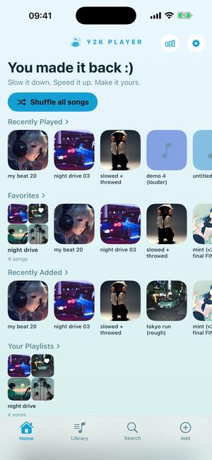
Aqua 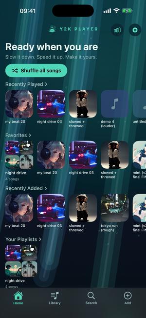
Fathom 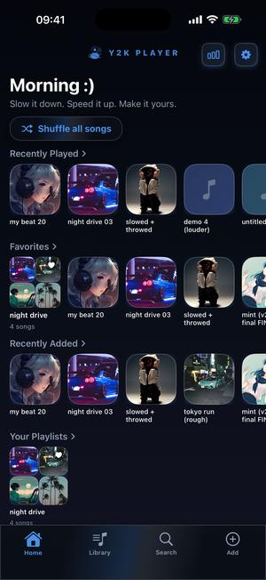
Wave
The same era, at four depths
Aqua — the palette without the postcard
The palest of the set: ice-blue at the top settling into soft mint at the bottom, white cards, one blue accent and one green one. No scenery, no glass on the controls — the era on a clear day with nothing happening, for when you want the colours and nothing else.
Breeze and the glass family — above the water
Breeze wears the frosted glass and the rounded type, and it is not alone. Lagoon is the same glass under a sheet of soft light bending across the screen. Azure takes it bluer, Petal pink, Orchid violet, Sunset orange, Platinum almost colourless.
Fathom and Deep End — under the surface
Fathom starts teal where the light still gets in and falls away to near black, keeping seafoam for whatever reaches the bottom. Its sky is the view from underneath: ribbons of refracted light angling down the frame with small bubbles rising through them. Deep End is its greener, shallower neighbour.
Wave, Horizon and Frost — after the glass went dark
The late end of the era, when everything glossy turned black. Wave is near-black panels, each crossed by a single diagonal ribbon of light, and its accent never settles — the palette walks the colour wheel continuously, so the app is a different shade tonight than this morning. Horizon and Frost hang an aurora behind the same dark glass, green in one and ice-blue in the other.
What the glass is actually made of
Worth spelling out, because “glassy” usually just means a pale gradient. A panel here is layered: whatever sits behind it is blurred into soft colour first, so it frosts rather than shows through; then a white-to-clear wash across the top half for the gloss; a faint wash of the theme’s hue rising from the bottom edge; a hairline white rim; and a shadow tinted the theme’s colour instead of grey.
That last layer is why the family does not feel like one theme recoloured: a pink theme gets pink glass, a green one green.
The controls follow: the play button is a disc of the theme’s accent with a gloss over the top half, a white rim and its own glow underneath, rather than a flat circle. The slider playhead stays a plain white dot on purpose: the era kept its small controls minimal even when the panels were not. The type across the whole app switches to a soft rounded face.
Putting one on
One tap. Nothing downloads and nothing restarts.
- Open the theme pickerIt sits at the top of Settings inside the app. Every entry is a live miniature of the real thing, drawn by the same code that draws the app, so you are choosing a screen rather than a swatch.
- Find the glass onesBreeze, Aqua, Lagoon, Azure, Petal, Orchid, Sunset and Platinum are the daylight end of the family. Fathom, Deep End, Wave, Horizon and Frost are the dark end. Each miniature carries its own sky, so the ones with scenery are obvious on sight.
- Tap BreezeThe change lands at once and covers the lot — library, player, sliders, playhead, tab bar and type. Nothing downloads and nothing restarts.
- Wait a few seconds on the home screenGive the ground time to move. The windmills turn, the water glints and the skyline drifts past; that is the half of the theme a still picture cannot show you.
- Decide what the visualizer doesOpen a song, open the visualizer picker and set the colour mode. Match theme dresses the scene in Breeze’s grass and sky; Classic gives every scene back its own signature colours; Shuffle deals a new set with each song.
The scenes that belong to this look
A theme paints the app; a visualizer fills the player while a song runs, drawn live off the audio. Several were written in this vocabulary. Hillside is a green hill under a wide sky with glass spheres drifting up through it. Dew is glossy bubbles rising through aqua light, bouncing on the beat. Ripple is a living water surface with caustic light wandering over it and beats landing like rain. Tide is a low moon over a far horizon, its light shaking on the water.
Colour is a separate switch with three settings. Match theme puts your theme’s colours into the scene, so Breeze gets grass and sky. Classic holds each scene to its own signature colours. Shuffle deals fresh colours every song. Hillside ignores the first of those and keeps its own green and blue, because it is a picture rather than a palette.
Plainly, before you install anything
- You bring the music. Y2K Player opens audio files that are already yours. Nothing is streamed and there is nothing to sign into.
- Nothing is locked behind a look. Speed runs from 0.25× to 2× and pitch from twelve semitones down to twelve up, and both behave the same in Breeze, in Aqua and in the free themes.
- Legibility is measured, not assumed. Breeze’s secondary text was darkened a shade to clear the contrast floor against the deepest green in its own gradient; Fathom’s primary text measures 12.8:1 against its lightest teal.
- Drawn from scratch. Each theme is a palette, a set of controls and a sky written for this app. A period gets evoked; nobody owns a period. No other company’s branding appears anywhere in it.
- Free to use. Pro is one payment — forever.
Put a song on and watch the windmills.
The horizon keeps drifting whether or not anything is playing.
Questions about the glass themes
The ones worth settling before the download rather than after it.
What is Frutiger Aero?
The name given afterwards to a design language that ran from the middle of the 2000s into the early 2010s: translucent glass panels with a hard gloss along the top edge, nature used as everyday furniture — sky, grass, water, bubbles — and light on every surface. It vanished from mainstream software almost overnight, which is why it now reads as a specific period rather than as a style.
Which theme should I start with?
Breeze. It is the one that commits to the whole idea: frosted glass on the panels, a rounded typeface across the app, and a background that is an actual landscape rather than a gradient. If it turns out to be too much scenery for you, Aqua is the same palette with a quiet ground.
Is the moving background a video?
No. There is no video file and no image file. The skyline, the water, the windmills, the grass and the bubbles are drawn on the device as you use it, on three different speeds so the far things and the near things move at different rates. That is also why it never repeats: the scenery is laid out around a world wider than the screen.
Will an animated theme flatten my battery?
The moving ground is one drawing surface at twelve frames a second, which is a small cost. Low Power Mode deliberately does not switch it off, because freezing every animated theme at once makes an app look broken rather than considerate — if battery is the concern, a plain theme is one tap away and that choice stays yours.
What is the difference between Aqua and Breeze?
Aqua is the palette only: ice-blue into soft mint, flat white cards, no glass on the controls and nothing happening behind them. Breeze is the palette plus the material plus the place — frosted panels, rounded type, and a horizon that drifts.
Does a theme change more than the player screen?
Yes. The ground, the panels, the buttons, the sliders and their playheads, the waveform colours and the typeface all move together, on every screen the app has rather than on the one used in the screenshots.
Can the visualizer match the theme?
It can, and it is a separate switch so you are never forced into it. Match theme dresses the scene in your theme’s colours, Classic gives every scene back its own signature palette, and Shuffle deals a new set with each song. Hillside is the one exception: it keeps its own green and blue whatever the mode, because a violet hill would look like a fault rather than a choice.
Is this a copy of an old operating system?
No. Every theme is written for this app — its own palette, its own controls, its own drawn sky. The period being evoked is not owned by anybody, and no other company’s branding, product or trade dress appears in the app.
Does any of it need a connection?
No. The themes are drawn on the device from code that ships with the app, playing files that are already on the phone. Airplane mode makes no difference to any of it.
Do I need a subscription?
Free to use. Pro is one payment — forever.
Where to go next
- All the themesEvery other era in the catalogue, named rather than counted.Open →
- VisualizersHillside, Dew, Ripple and the rest, running full screen off the audio.Open →
- Slowed + reverbThe sound most people are listening to behind the glass.Open →
- ProWhat the one payment opens, and what stays free.Open →
- Cute Music Player for iPhoneKawaii & Coquette · iPhone & iPadOpen →
The wettest music player on your phone.
Import a song, tap Breeze, and let the windmills go round behind your library.
Free to download and keep. Pro is a one-time purchase — buy it once and it never renews.