
Y2K themes · iPhone & iPad
Liquid chrome,
and the app underneath.
Gunmetal panels, machined silver rims and one electric blue — drawn as geometry rather than photographed off a bumper.
Two themes sit outside Pro. There is a 72-hour window to try the rest.
- Gunmetalwith a machined silver rim
- Every screenlibrary, player, tab bar
- Offlinenothing to fetch
The turn of the millennium had a material, not just a palette
Ask what the Y2K look was and the answer usually comes back as colours: silver, electric blue, a little lilac. That is the easy half. What made a screen from that moment recognisable is that every surface claimed to be made of something. Panels behaved like brushed metal. Edges caught light along the top and lost it toward the bottom. Highlights were hard enough to look stamped rather than painted. You were not looking at a rectangle, you were looking at a slab.
Chrome is the theme in Y2K Player built to that description, and it is built literally rather than from a mood board. One panel is a three-stop vertical gradient falling from light gunmetal through a mid grey into near-black, with a white shine laid across the top that has faded out inside the first fifth of the panel and never reaches the middle. Around it runs a hairline rim whose own gradient starts bright silver at the top edge and darkens as it comes down the sides — light arriving from above onto a bezel, which is exactly what that rim is imitating. Underneath sits a shadow tinted with the theme’s own electric blue rather than plain black, so panels glow faintly instead of merely resting on something.
None of it is a photograph of metal. There is no steel texture anywhere in the app: every bevel, rim and specular is drawn as geometry at the size it appears, which is why it stays crisp on any screen and adds nothing to the download.
Where the metal actually shows up
A theme is only as convincing as its smallest control, so these are the ones worth naming.
The knob you drag
The speed and key sliders carry a small machined disc: a top-lit silver gradient wearing the same two-tone rim as the panels, sunk under a tight shadow. It is sixteen points across, and it is the part of the theme your thumb spends the most time on — which is why it was drawn rather than tinted.
The play button
A polished disc whose gradient runs bright, dark, bright again, then dark — four stops, because a curved metal face under one light source gives you two highlights, not one. The glyph on it is near-black rather than white, which is how a physical button of that era read: dark mark, bright steel.
The library rows
Songs become steel strips. Each row is a dark face with a shine along its top edge, stacked so the list looks milled out of a single block. The row that is playing takes a blue wash across the whole strip instead of a coloured bar sitting beside it.
The bar along the bottom
The tab bar is a slab with a machined seam at its top edge: a dark hairline with a bright one immediately beneath it. That pairing is the oldest sentence in this visual language, and it says: a new piece of metal begins here.
The type
Chrome sets the entire app in a monospaced face. Every character takes the same width, so digits stack into columns and a speed readout ticks in place rather than shuffling sideways as it changes. It reads as a machine reporting a number, which is precisely the register the era enjoyed.
Getting it onto your phone
A handful of taps, and nothing downloads.
- Bring a song inY2K Player plays files that are already yours — a purchase you downloaded, your own rip, a recording you made. Share one into the app, or add it from the plus button. Nothing is fetched from a catalogue, because there is no catalogue in here.
- Open the theme pickerIt sits at the top of Settings. Every entry is a working miniature built from the real app, with your own songs in it, so Chrome’s bevels and silver rims are visible before you commit to anything.
- Choose ChromeThe change lands everywhere at once: panels, sliders, the play button, the song rows and the bar along the bottom. Nothing restarts and nothing downloads.
- Judge it on the player, not the home screenOpen a song. The player is where a theme is actually tested — the speed and key sliders, their machined knobs, the playhead and the sheet that rises over all of it are carrying the same metal.
- Let the visualizer follow, or don’tMatch theme in the visualizer picker pulls the scene onto Chrome’s own ramp, steel blue into silver-white. Switch it off and every scene keeps the palette it was drawn in.
Four neighbours on the same shelf
The same app, captured the same way, wearing different eras.
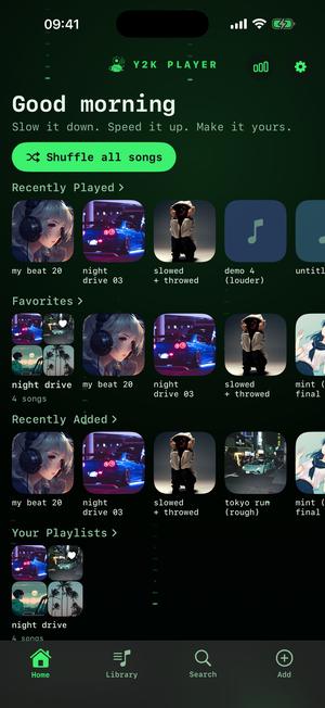
Cipher 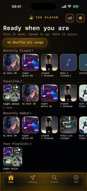
Diode 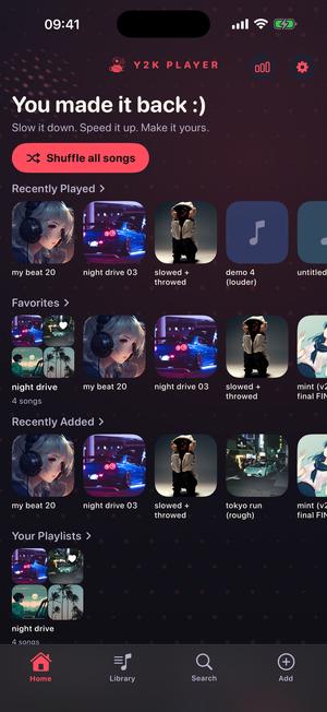
Halftone 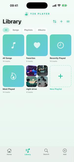
Mint
Chrome is one answer to Y2K. There are others.
Obsidian wears the identical metal over a near-black ground, but trades the blue for mercury silver and lets its background breathe instead of holding still. Cyber takes the other road out of the same year: deep blue-black, electric cyan running into hot magenta, monospaced type, no bevels at all. Cipher is the phosphor terminal — one green on near-black, a sparse rain of abstract marks falling behind the shelves, and a hue wheel if your green is a different green. Diode is that instrument in amber under a slow scan. Platinum is the daylight cousin, pale aluminium with soft edges. Stargaze is the quiet one, and Dial-Up is the loud joke: grey dialog bevels stranded on a teal desktop.
All of them are drawn from scratch for this app. They are made to feel like a period rather than to reproduce a product — no company’s marks, no traced trade dress, no borrowed artwork anywhere in the set. An era belongs to everybody. A product does not.
Why a music player is called Y2K Player
Because the arrangement it offers was ordinary then and is unusual now. You bring a file you already own, it lives on the device, and you can bend it: speed travels from a quarter of the original up to double, with the slider covering half to one-and-a-half and steppers reaching the extremes beyond that, while the key moves twelve semitones in either direction. The two can be locked together, the way a record drops in pitch when you slow the platter, or separated so a song gets longer without changing key.
Every song remembers its own settings, and nothing edits the file you imported. There is no catalogue inside the app, nothing to log into, and nothing that stops working on a plane. The chrome is not nostalgia bolted onto a modern service; it is honest dress for what is underneath.
The chrome changes. The furniture never moves.
That is the rule the whole system is built on. A theme restyles surfaces and is not allowed to relocate anything: buttons stay where your thumb learned them, shelves keep their order, sliders keep their travel. Chrome looks heavy and Mint looks like nothing at all, and underneath they are the same app with the same map. Switching is a decision about mood, never a decision to relearn a screen.
Contrast is measured rather than assumed, too. Palettes are checked against the ground they actually sit on, and the label on a filled button is coloured by whichever of ink or white genuinely reads better on that accent — not by whether the theme happens to be dark. A look you cannot read is not a look.
Worth knowing before you install
- Two themes sit outside Pro — Deep Space in the dark, Mint in the light — and they never expire. Chrome, Obsidian, Cipher, Diode, Platinum and the rest are part of Pro.
- There is a 72-hour window to try them, and while it is open every theme in the app is selectable. The app announces the window when it opens, not after it has closed.
- The effect rack is not in that window. Reverb, the equaliser and the others are Pro from the start. Speed and key are free on every song.
- Free to use. Pro is one payment — forever.
- Bring your own songs. Y2K Player plays audio files already on your device. It is not connected to a streaming service and does not import from one.
- The themes are original work. They evoke an era; they are not reproductions of anybody’s software, hardware or branding.
Questions about the Y2K look
The ones that decide whether this is the app you meant.
Which theme is the chrome one?
Chrome. It is the dark one built on gunmetal panels, machined silver rims and a single electric blue accent, with the whole app set in a monospaced face. Obsidian uses the same metal over a much darker ground with silver in place of the blue.
Is the metal a texture image?
No. Every face, rim, shine and specular is drawn as a gradient at the size it appears on your screen. That is why it stays sharp at any scale, why it costs nothing in download size, and why it recolours cleanly rather than looking like a photograph someone tinted.
Does the theme change the whole app or just the player?
The whole app. The library shelves, the song rows, the player, the sliders and their knobs, the playhead, the sheets that slide up and the bar along the bottom all take the same treatment. There is no screen left sitting in a default grey.
Is Chrome a copy of an old operating system?
No, and deliberately so. It is original work built to feel like a period: no company’s marks, no traced interface, no borrowed artwork. What it reproduces is an idea about how a surface should behave under light, which nobody owns.
Can I try it before paying for anything?
Yes. There is a 72-hour window, and while it is open every theme in the app is selectable rather than just one. The app tells you the moment the window starts instead of the moment it ends.
Which themes are free?
Two: Deep Space for the dark side and Mint for the light. Neither expires and neither turns into a trial later. Free to use. Pro is one payment — forever.
Can the visualizer match the theme?
Yes. Match theme in the visualizer picker pulls whichever scene is running onto the theme’s palette — under Chrome that is steel blue through to silver-white. Turn it off and each scene keeps the colours it was designed in.
Does the app icon change with the theme?
Not automatically, but there is a family of alternate icons to choose from separately, and a couple of them cost nothing. The mark is a stencil punched out of a coloured plate rather than a picture pasted onto one, so it stays legible at home-screen size.
Does any of this need a connection?
None of it. The themes are code, the songs are files you already have, and the app has no catalogue to reach for. It behaves identically with the wifi off.
I want the Y2K colours without the bevels. Anything?
Cyber. Deep blue-black with electric cyan running into hot magenta and monospaced type, but flat surfaces throughout — the same year, the other half of its taste.
Does it work on iPad?
Yes, and the chrome is laid out for the larger screen rather than stretched onto it.
Where to go next
- All the themesThe full shelf: aero glass, vaporwave, kawaii and everything between.Open →
- VisualizersStorm and Gloss push liquid chrome around, drawn live off the track.Open →
- Slowed + reverbWhat a lot of people are listening to while wearing this look.Open →
- NightcoreFaster and higher — the other direction from the same two sliders.Open →
- Galaxy Theme Music Player for iPhone &mdThemes · Stargaze & GalaxyOpen →
Pick an era and let it dress the whole thing.
Bring one file you already own, choose a theme, and every screen is wearing it before you put the phone down.
Free to download and keep. Pro is a one-time purchase — buy it once and it never renews.