
Themes · Arcade
Bitmap letters.
A floor that keeps arriving.
Arcade is the cabinet-and-console-dashboard look: a pixel typeface on every label in the app, and a grid horizon computed behind your library while you scroll it.
Free to use. Pro is one payment — forever.
- Bitmap facethe whole app, not a logo
- Horizon griddrawn live at 12 fps
- One tapno restart, nothing to fetch
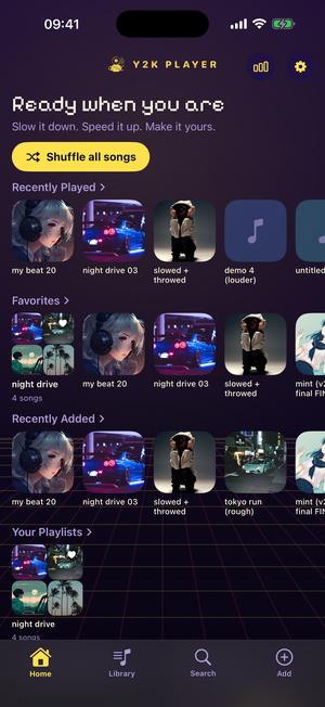
Arcade keeps its era in the lettering
Themes that chase a cabinet or a console dashboard usually start with the buttons. This one starts with the letters, which is why it reads from across a room.
A bundled bitmap face — Pixelify Sans, carried inside the app under the SIL Open Font License — becomes the interface font the moment the theme goes on. Every label that has not asked for something else inherits it: the greeting at the top of the home screen, the headings above your shelves, the titles in the song rows, the speed readout sitting over the slider, the words on the buttons in every sheet that slides up. Nothing here is a picture of pixel type dropped into a layout; while Arcade is on, it is what the app is written in.
The panels stay flat and modern, and that is a decision rather than an omission. The handheld look a few rows away wears warm near-white plastic and hairline-bordered tiles, because a handheld is an object you hold and its surfaces are the memory. A cabinet is a dark box in a dark room. What anyone actually remembers of one is the light coming off the glass and the shape of the letters burned into it, so Arcade spends everything there and leaves the controls alone. No fake screws, no moulded plastic, no bevel catching a light that is not in the room.
The floor is computed, not a wallpaper
Measured against your screen every frame rather than stretched to fit it.
Behind the library a horizon grid runs away from you, and how it is built is why it does not read as clip art. Sixteen horizontal rows are placed on a perspective series instead of at even intervals — even intervals make a ladder, and a ladder is not a floor. Nineteen verticals fan from a single point sixty-two per cent of the way down the screen and spill off the bottom edge. The rows take the theme’s yellow and the verticals its magenta, both at the low opacity that keeps a background a background. The field scrolls toward you on a loop a shade over a second and a half long, so the floor is permanently arriving and never visibly repeating.
It is drawn twelve times a second, which is deliberate: at this speed twelve reads as motion and costs a fraction of sixty, which matters under a player left running. In Low Power Mode the drawing stops and the theme falls back to its plain gradient, with no setting to go hunting for.
The ground beneath the grid moves too. Arcade is one of the looks that opted into a living background: the gradient’s axis drifts in a slow orbit while a faint glow of the accent breathes across the top of the screen, deliberately kept out of the middle band where text sits. Two motions on two clocks, neither fast enough to catch you mid-sentence.
Four colours, and where each one lands
The ramp is warm yellow #FFE14D, hot magenta #FF3D8B, cyan #4DF2FF and screen green #8CFF5A, over an indigo ground that falls to near-black by the bottom of the screen. Yellow is the accent proper: the play button, the fill in the speed and pitch sliders, the shuffle pill, anything currently active. Cyan is the far end of the waveform gradient, so the part of a track you have played and the part still coming are two different lights. Type is warm cream; the quieter second line is lavender, borrowed from the ground rather than greyed out of it.
That four-stop ramp does more work here than in most looks. One wearing a heavy chrome keeps its ramp for the visualizer and lets the chrome’s own accent pair run the controls. Arcade’s controls are flat, so the interface gradients draw from all four colours instead: the sliders, the playhead and the mark at the top of the home screen pull from the same wheel the visualizer does.
Putting it on
One tap, and nothing downloads.
- Get a song into the appImport an audio file, or share one in from wherever it lives on the phone. Y2K Player works on audio you already have; there is no catalogue to browse first.
- Find the theme pickerIt is inside Settings. Each card there is the app itself running in that look, so Arcade’s lettering and its moving floor are on screen before you commit to either.
- Choose ArcadeThe whole app turns over at once — library, player, sliders, playhead, tab bar and typeface together. Nothing restarts, and nothing has to download first.
- Put a scene behind itOpen the visualizer picker from the player. Hyperdrive, Nightdrive and Boogie are the three that belong with this one, and Match theme hands whichever you choose Arcade’s four colours.
- Match the home screenThe alternate icon set includes an Arcade icon, so the tile you tap can agree with the app it opens.
What it sits next to
Four screens out of the same build, shot in the same spot, each carrying a different memory of a machine.
Arcade 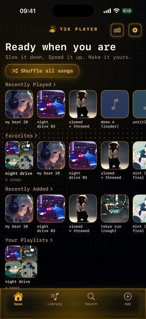
Diode 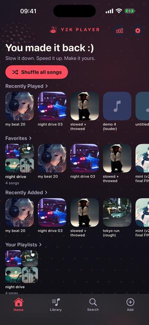
Halftone 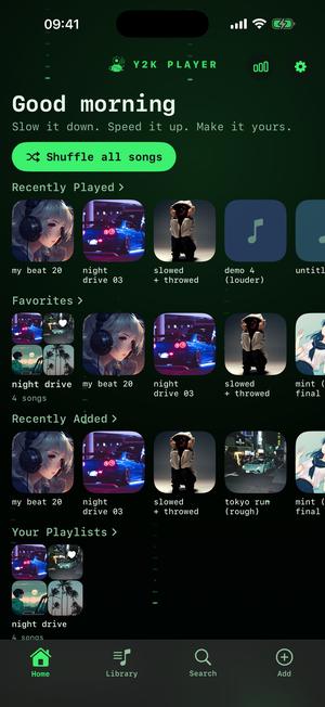
Cipher
The rest of the machine-room shelf
If Arcade is the cabinet, these are the boxes stacked around it — each a different decade’s idea of what a screen does when nobody is playing.
- Versus — CRT blacks with health-bar gold and danger red, set in a machine readout. Fighting-game energy, no borrowed marks.
- Circuit — dark metal with a toxic green light breathing out of the seams, typed like a start-up screen.
- Console — midnight blue-black, silvery text, one cool cyan light, and silver fog drifting through the dark behind it.
- Plaza — the opposite direction: glossy white, grey hairlines, calm sky blue, channel tiles. The lobby rather than the game.
- Pocket — warm near-white plastic, a seafoam panel, white tiles with hairline borders and a soft rounded face.
- Wave — black glass and a ribbon of light whose hue walks a slow circle and never stops.
- Diode — an amber readout on near-black with a scan crossing it, and a tint wheel if you would rather it were green.
- Cipher — phosphor green on true black, with abstract dashes and dots falling behind the interface.
Vaporwave is worth knowing if it is specifically the grid you came for. It uses the same horizon sky and arrives somewhere else entirely: pastel pink and cyan, monospaced, a sun resting on the line. One sky, two looks, no resemblance — which is roughly the argument for the whole catalogue.
What to put behind it
A theme paints the app; the visualizers are the half that moves with the audio, and three belong with this one. Hyperdrive is a neon tunnel flown at full speed, its walls made out of your spectrum. Nightdrive is a striped sun over a neon grid horizon that pumps with the bass — the moving cousin of the floor Arcade already stands on. Boogie is a pocket LCD dance crew whose poses snap on every beat.
How a scene gets its colours is a setting rather than a rule. Match theme hands it Arcade’s four stops, so the tunnel walls come back yellow, magenta, cyan and green. Classic lets every scene wear the palette it was designed in. Shuffle deals fresh colours with every song.
Said plainly
- Free to use. Pro is one payment — forever.
- Arcade sits behind Pro, and wearing it opens a seventy-two-hour window on the house. You are told the moment that clock starts, not the moment it runs out.
- A look is decoration and nothing else. No capability hides behind one: speed still runs 0.25x to 2.0x and pitch still bends twelve semitones either way, whichever look is on.
- It plays audio already sitting on your phone. Nothing here browses somebody else’s library, and there is nothing to sign into.
- Nothing is fetched when you switch. Every look ships inside the app, so changing one works in airplane mode.
- Original work. Arcade evokes an era. It is not a copy of any company’s product, dashboard or device, and nobody’s marks appear anywhere in it.
Questions about the Arcade look
Worth answering before you install rather than after.
What does the Arcade theme actually change?
The ground, the panels, the accent pair, the waveform gradient, the sliders, the playhead, the tab bar and the typeface — all at once. The bundled bitmap face becomes the app’s interface font, so shelf headings, song rows and the speed readout are set in it, and a horizon grid replaces the plain gradient behind everything.
Is the grid a video or a wallpaper image?
Neither. Sixteen rows and nineteen verticals are computed against your screen’s own dimensions and redrawn twelve times a second, scrolling toward you on a loop a shade over a second and a half long. In Low Power Mode the drawing stops and a plain gradient takes its place.
Is the pixel lettering a real typeface?
Yes, and a bundled one: Pixelify Sans, under the SIL Open Font License, shipped inside the app rather than fetched from anywhere. While Arcade is worn it is the app’s body font, not an image of lettering dropped into a layout.
Is Arcade free?
It is part of Pro, and wearing it opens a seventy-two-hour window announced at the moment the clock starts rather than after it stops. Free to use. Pro is one payment — forever.
Which visualizer should I run with it?
Hyperdrive for a neon tunnel flown at speed, Nightdrive for a striped sun over a grid horizon that moves with the bass, or Boogie for an LCD dance crew that snaps poses on the beat. Leave the colour mode on Match theme and any of them comes back in Arcade’s yellow, magenta, cyan and green.
Is this a copy of a particular machine or dashboard?
No. It is original work built in the spirit of an era: a palette, a typeface and a drawn sky. No company’s product, device, dashboard or marks appear in it, and nothing was traced from one.
Does it work without a connection?
Completely. Every look ships inside the app and the grid is drawn by your own phone, so switching in airplane mode works exactly the same and nothing downloads when you do.
Will the moving background hurt my battery?
It is kept deliberately cheap: twelve frames a second of flat lines and a couple of gradient fills, rather than sixty. Low Power Mode drops it to a static gradient on its own, without being asked.
Does the look change what the player can do?
No. Speed from 0.25x to 2.0x and pitch across twelve semitones in either direction are there whichever look is on, as is everything else. Choosing one is decoration, not a switch.
Is there a matching app icon?
Yes — an Arcade icon sits in the alternate icon set, so the tile on your home screen can agree with the app that opens from it.
What if I want the grid but not the yellow?
Vaporwave runs the same horizon sky in pastel pink and cyan with monospaced type and a sun on the line. Diode and Cipher each carry a tint wheel, so if what you want is one light in a colour of your choosing, start with those.
Will my choice follow me to a new phone?
Yes. The look you picked rides your own iCloud, so a new device opens wearing it. Your audio files stay put on each device rather than syncing.
Where to go next
- Every lookThe whole shelf, and what a theme repaints on the way to a song.Open →
- VisualizersThe half that is drawn live off the audio while you listen.Open →
- NightcoreThe speed and pitch this look was built to sit behind.Open →
- ProWhat one payment opens, Arcade included.Open →
- Frutiger Aero Themes for an iPhone MusicFrutiger Aero · iPhone & iPadOpen →
- Galaxy Theme Music Player for iPhone &mdThemes · Stargaze & GalaxyOpen →
Put the cabinet on.
Bring a song, open Settings, and the whole app is wearing bitmap letters and a moving floor before the track is over.
Free to download and keep. Pro is a one-time purchase — buy it once and it never renews.