
Themes · Vaporwave
Vaporwave,
from the floor up.
Violet dusk, a hot pink and a cold cyan, monospaced type, and a horizon grid the app draws behind your whole library.
Free to use. Pro is one payment — forever.
- Pink & cyan#FF7BD5 and #53E0F0
- Drawn, not pastedthe grid is code
- Monospacedacross the whole app
Four colours, and a floor going away from you
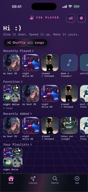
Vaporwave is the theme's actual name inside the app, and it is a short list of decisions you can check against the screen.
The ground falls from a violet dusk, #2B1B4D, at the top of the display to a near-black indigo, #120A2A, at the bottom. Two accents carry everything after that: a hot pink, #FF7BD5, and a cold cyan, #53E0F0. Those same two are the ends of the waveform gradient, so the scrubber under your artwork runs pink where the song has already been and cyan where it is going.
Then a fourth thing, which separates this from a two-colour theme. Vaporwave carries a full ramp — the pink, a violet #B07BFF, the cyan, and a pale gold #FFE07B — and the app treats that ramp as the theme's identity rather than as decoration. It is what the visualizer blends across, and why this theme's card in the picker flows its colours instead of sitting still beside the others.
The type changes, not only the paint
Vaporwave sets the whole app in a monospaced face. Track titles, shelf headings, the tempo readout, the greeting at the top of the home screen — all of it lands on a fixed grid of character widths. That one choice does more for the mood than any hue: even columns, terminal spacing, the faint sense of something printed rather than typeset.
The panels are black glass, not purple
Every card, pill and sheet here is a near-black pane at #0A0E16 with one diagonal ribbon of light drawn corner to corner across it in the theme's tint, a thin white rim and a soft shadow beneath. That is why the Shuffle pill in the picture reads as smoked glass over the dusk rather than as a lavender button: the furniture is dark and the light on it is pink.
It stays readable, and that part was measured
Bright pink on violet is where this aesthetic usually falls apart. The text colours are a warm white, #FDF0FF, and a muted lilac, #B9A7D8, and the dimmer of the two measures just over 7:1 against the lightest surface it ever sits on. The pink measures about 6.6:1 on the same ground and the cyan about 9.7:1. You can read a song title at arm's length, which is not a given for a look made of neon.
The grid is drawn, not a wallpaper
Behind the shelves is a horizon with a lattice running out from under it. No image file is involved.
The horizon sits at 62% of the screen's height, with sixteen lines below it. They are not evenly spaced — the gap grows on a squared series, so they pile up tight near the horizon and stretch out toward your thumbs. Even spacing reads as a ladder, not as distance. Nineteen more lines fan down from the vanishing point: twelve points apart at the horizon, a sixth of the screen's width apart by the bottom edge.
The horizontals are drawn in the pink and the fan in the cyan, both kept faint so nothing competes with a track title. The field creeps forward on a loop a little over a second and a half long — slow enough that you catch it while choosing something and never while reading.
The gradient behind it is alive too, its axis drifting in a slow orbit while a faint glow breathes across the top, about twelve redraws a second. Low Power Mode stops the motion and leaves the plain gradient.
Most attempts at this look paste a picture behind an otherwise ordinary app. Here the floor belongs to the same drawing as the panels standing on it, so it never slides out of register, never turns up as a soft JPEG on a large display, and fits whatever screen it lands on.
Switching it on
A few taps, and the music keeps playing throughout.
- Open Settings inside the appThe gear sits in the top-right corner of the home screen, beside the visualizer button. The theme wall is near the top of that page, above the player and storage rows.
- Find Vaporwave near the frontThe wall is ordered by what lands best rather than alphabetically, so Vaporwave is in the opening run. Its card draws its own miniature horizon and flows all four of its colours, which is how you spot it before committing to it.
- Tap the cardEverything repaints at once: the shelves, the player, the sliders, the playhead, the sheets, the tab bar, and the type along with them. Nothing restarts and nothing is fetched.
- Decide what the visualizer doesIn the player's visualizer picker, Match theme hands the scene Vaporwave's pink and cyan. Nightdrive is the one built around a horizon. Classic leaves every scene in the colours it was designed in.
- Match the home screen tileThe icon list sits directly under the theme wall in Settings and has a Vaporwave alternate, so what you tap on the home screen belongs to what opens behind it.
The same screen, four ways
One home screen, captured identically, wearing Vaporwave and three of its nearest neighbours.
Vaporwave 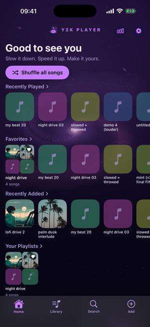
Galaxy 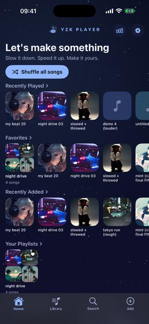
Stargaze 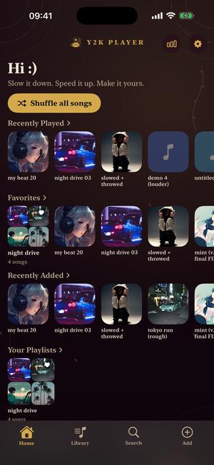
Rosarium
Galaxy keeps the magenta-through-cyan run and swaps the floor for a turning field of dust. Stargaze is the cold, quiet end of the same night. Rosarium shows how far the furniture moves: serif type, gold arcs, no neon.
The sun belongs to the visualizer
The theme gives you the floor. The striped sun over it is switched on separately, in the player.
Open a song, tap the visualizer button and pick Nightdrive. It draws a disc on the horizon cut by bars that widen toward its base, a sky whose points of light sharpen on the high frequencies, and a perspective floor scrolling toward you. The scroll is tied to the low end and to the moment a kick lands, so the road pulls harder in the chorus, and a glow on the horizon swells with the bass.
Leave the colour mode on Match theme and Nightdrive takes Vaporwave's own pair: the sun runs pink at its base into cyan at its crown, the lanes glow pink, the cross lines glow cyan. Classic gives it back the colours it was designed in. Shuffle picks a fresh coherent set for every song.
What people actually play in it
This is the look people wear while the song is being bent.
Speed runs from a quarter to double: the slider covers half to one-and-a-half and the steppers either side move in five-percent increments to reach the rest. Key is its own control, twelve semitones down to twelve up, with a quarter-semitone mode for matching something precisely.
The one-tap starting points sit above the sliders. Slowed + Reverb drops the track to 0.85× with the key falling along with it, opens a wide room around it and widens the stereo image. Sped Up takes it to 1.25×. Nightcore goes to 1.35× with the key riding up the way a record does when it spins faster. Each is a place to start, and None puts the song back as it was recorded.
All of it happens on files you already own — brought in from Files, shared in from another app, or taken from the songs synced onto the device. Nothing is fetched, nothing is uploaded, nothing needs a signal.
Straight answers before you install
- Vaporwave is part of Pro. Free to use. Pro is one payment — forever. The free looks are Deep Space and Mint, one dark and one light, and neither is a stripped-down demonstration.
- You can wear it before deciding. A Pro theme opens a three-day window, and the app says so at the moment it starts.
- The home screen icon can match. There is a Vaporwave app icon among the alternates, so the tile belongs to the same palette as the app it opens.
- It is original work. The grid, the palette, the panels and the type are drawn for this app in the spirit of an era, not copied from any company's product.
- A theme never gates a feature. Speed, key, looping and exports behave the same whichever look you wear.
- Nothing downloads. Themes ship inside the app, so switching one works in airplane mode.
Questions about the Vaporwave theme
The specifics, answered against what the app actually draws.
Does Y2K Player have a vaporwave theme?
Yes, and it is called Vaporwave. A violet dusk ground, a hot pink #FF7BD5 and a cold cyan #53E0F0 doing all the work, monospaced type on every screen, near-black glass panels, and a perspective grid drawn behind the entire app. It is part of Pro.
Is the grid in the background an image?
No. The app draws it line by line, every frame: a horizon at 62% of the screen's height, sixteen horizontals crowding toward it on a perspective spacing, and nineteen verticals fanning out from the vanishing point. That is why it stays sharp on any display and reshapes itself to any screen.
Does anything move?
The grid creeps forward on a loop a little over a second and a half long, the background gradient drifts on a slow orbit, and a faint glow breathes across the top of the screen. It redraws about twelve times a second. Low Power Mode holds all of it still.
Will it cost me battery?
Very little. The floor is a few dozen strokes a frame at twelve frames a second, not a video being decoded. A full-screen visualizer is the expensive thing in this app; the theme underneath it is not.
Which visualizer should I run with it?
Nightdrive, which is the one built around a horizon: a striped sun, a scrolling floor and a glow on the skyline that swells with the bass. Under Match theme it wears Vaporwave's pink and cyan, and so does every other scene in the picker.
Can I have the palette without the grid floor?
Yes, from its neighbours. Galaxy keeps the magenta-through-cyan run and replaces the floor with a slowly turning field of dust. After Hours is the same violet with a starfield over it. Stargaze is the cold, quiet version of that night.
Does the theme change the app icon too?
Not on its own, but there is a Vaporwave icon in the alternates list, which sits directly under the theme wall in Settings. Choosing it is one extra tap.
Is the Vaporwave theme free?
Free to use. Pro is one payment — forever. Vaporwave sits in the Pro set, and putting it on opens a three-day window first so you can live with it before deciding. Deep Space and Mint are free permanently.
Does it need a connection?
No. The palette, the panels and the grid are all code inside the app, so switching to it in airplane mode is instant and downloads nothing.
Is this a copy of some old product or operating system?
No. It is drawn from scratch for this app, in the spirit of an era rather than after any particular thing from it. No company's product, device or marks are reproduced anywhere in it.
Does the monospaced type make anything harder to read?
It changes the rhythm rather than the legibility. Long titles occupy more width, so they marquee sooner; the trade is even columns and terminal spacing, which is most of why the theme reads the way it does. Every other theme leaves the system face alone.
Does a theme change how my music sounds?
Not at all. Vaporwave repaints the app and nothing else. Speed, key, the effect rack and every export behave identically whichever look you are wearing.
Where to go next
- Every themeThe rest of the wall, and how far a theme reaches.Open →
- VisualizersNightdrive and the other scenes, drawn off the audio.Open →
- Slowed + reverbThe setting this palette gets worn with most.Open →
- NightcoreThe faster end: 1.35×, with the key riding up.Open →
- Retro Arcade Music Player Theme for iPhoThemes · ArcadeOpen →
- Y2K Aesthetic Music Player for iPhoneY2K themes · iPhone & iPadOpen →
Put the grid under your library.
No account to make, nothing to fetch, and the whole look works with the phone in airplane mode.
Free to download and keep. Pro is a one-time purchase — buy it once and it never renews.